1 Pages (7 items)
How to show specific lables on axis in logarithmic plot? - Messages
#1 Posted: 1/17/2023 11:23:15 AM
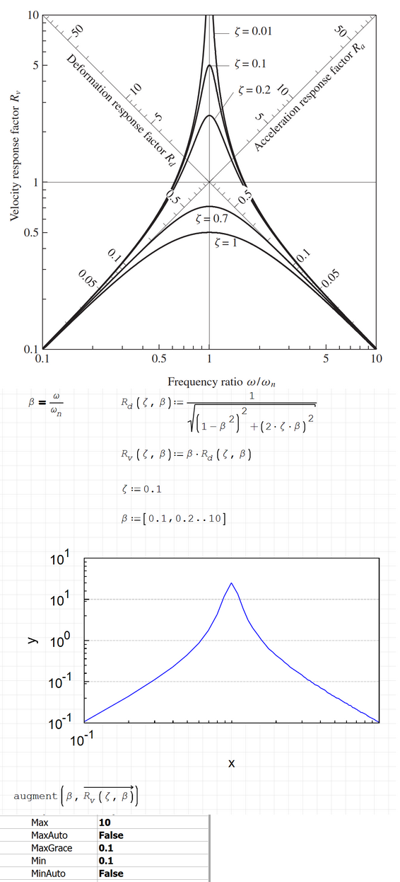
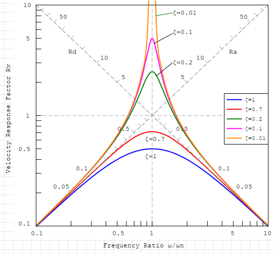
The logarithmic plot on the top of the image shows 0.1, 0.5, 1, 5 and 10 on both x and y axis (log scale).
I insert a Zedgraph, and set 0.1 to min and 10 to max, as shown in the image.
But the lables on Y axis has two 10^-1 and two 10^1, while lables on X axis has only one 10^-1.
How to show 0.1, 0.5, 1, 5 and 10 on both x and y axis?
PS. The two 45 degree axises for Rd and Ra on the top image are ingored in Smath.
Worksheet2.sm (36.09 KiB) downloaded 1084 time(s).
#2 Posted: 1/17/2023 12:27:21 PM
Too many things are missing in there !
#3 Posted: 1/17/2023 11:39:35 PM
Which things are missing?
#4 Posted: 1/18/2023 11:12:27 AM
WroteWhich things are missing ?
These two work well.
2DPlots ZedGraph log-log.sm (99.81 KiB) downloaded 1079 time(s).
Laplace Admittance.sm (153.39 KiB) downloaded 1098 time(s).
#5 Posted: 1/19/2023 3:13:26 PM

Greetings,
I would encourage you to review Overlord's post on the following forum: https://en.smath.com/forum/yaf_postsm70646_XY-PLOT-Logarithmic-scale.aspx#post70646
In the case you cannot format the axis labels as you so desire, you also have the ability/option to insert text and draw lines on the graph; thus creating your own axis data (technically plotted data, but it would appear as expected). On that note, you can also draw in those lines at the 45°; just need to draw a line with regards to your axes being calibrated in log cycles: (https://geology.humboldt.edu/courses/geology531/531_handouts/equations_of_graphs.pdf)
Hope this helps!
-Kenny Lemens, P.E. ᵂᴵ
I would encourage you to review Overlord's post on the following forum: https://en.smath.com/forum/yaf_postsm70646_XY-PLOT-Logarithmic-scale.aspx#post70646
- In short, you might want to consider the use of the 「X-Y Plot Region」 Plugin might serve you better than 「Zedgraph」.
In the case you cannot format the axis labels as you so desire, you also have the ability/option to insert text and draw lines on the graph; thus creating your own axis data (technically plotted data, but it would appear as expected). On that note, you can also draw in those lines at the 45°; just need to draw a line with regards to your axes being calibrated in log cycles: (https://geology.humboldt.edu/courses/geology531/531_handouts/equations_of_graphs.pdf)
Hope this helps!
-Kenny Lemens, P.E. ᵂᴵ
"No matter where you go, there you are." -Buckaroo BanzaiHotkeys: https://en.smath.com/forum/resource.ashx?a=45771&b=2
#6 Posted: 1/19/2023 11:17:18 PM
WroteI would encourage you to review Overlord's post on the following forum:
I don't know how to easily rotate text in XYPlot or even it is possible.
But a lot of portion of your function can be plotted by mentioned method.
I am not sure accuracy of crossline ticks however.
I only implemented it to show this can be done.
Regards
PS: Refreshed with spline plots.
Worksheet2.sm (34.89 KiB) downloaded 1164 time(s).
5 users liked this post
NDTM Amarasekera 1/19/2023 11:22:00 PM, Alvaro 1/19/2023 11:55:00 PM, bdrunagle 1/20/2023 4:24:00 AM, churichuro 1/20/2023 12:29:00 PM, netsonicyxf 7/6/2023 11:53:00 PM
#7 Posted: 1/19/2023 11:55:45 PM
1 Pages (7 items)
- New Posts
- No New Posts