After wasting an hour when looking for errors in a student's worksheet it turned out to be a case issue.
The problem was promoted by the similarity of uppercase P and lowercase p in a text index.
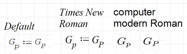
This drove me into trying other fonts for formulas, starting with Times new Roman. This is significantly narrower than the LaTeX Computer Modern, but still better than the default
In the image, if you do not zoom in really hard, it is very difficult to distinguish G.p and G.P. The lowercase letter seems even heavier than the uppercase one.
Of course this is not a systematic research and not a substantial proposal. I just want to rise the issue to hear other user's opinions on the subject.
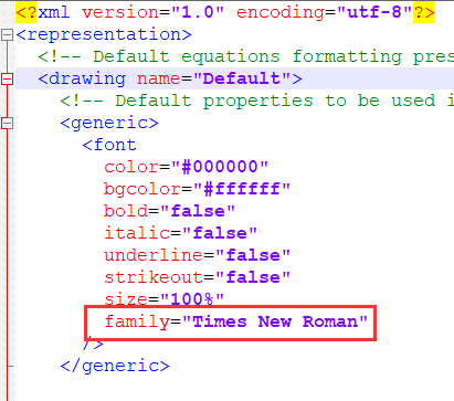
In case you wonder how to change the font, have a look at the file representation\settings.prop in the installation directory of SMath.
In SMath default, p seems to be heavier than P. The other fonts don't have that problem.
Screenshot at 100%
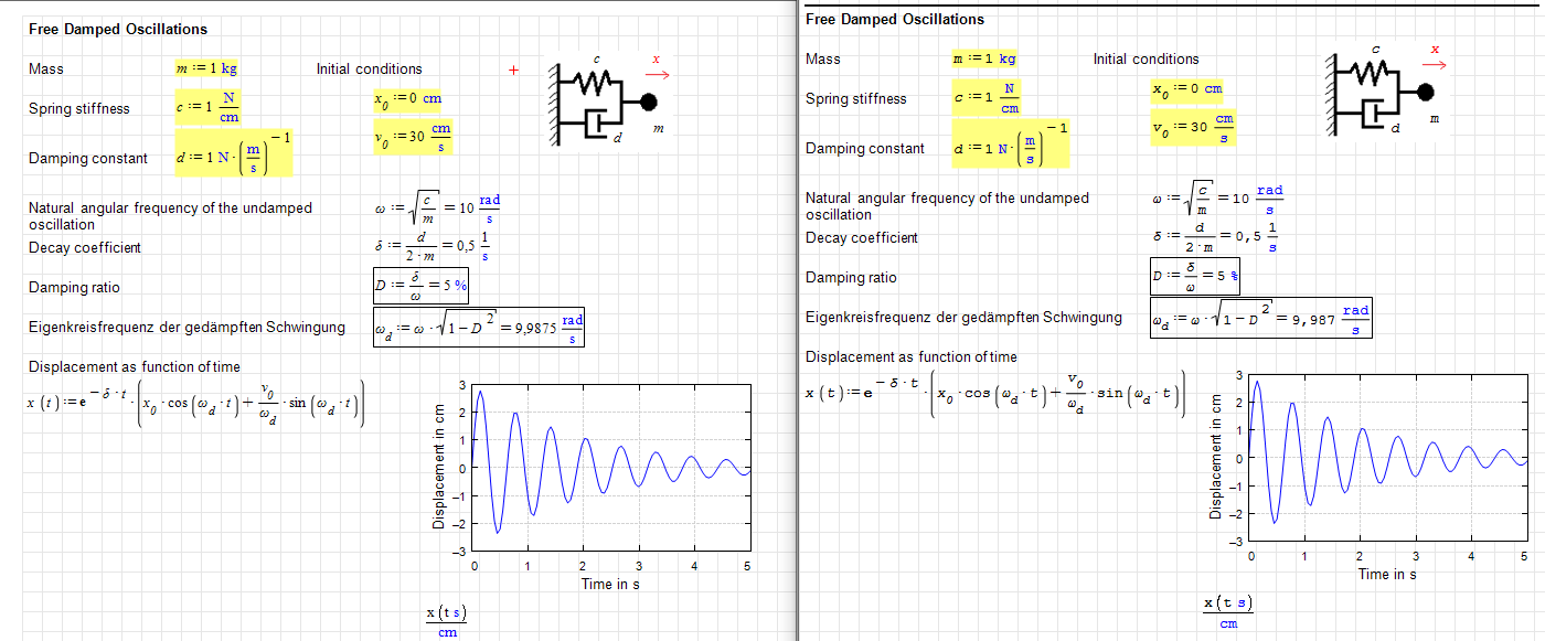
Copy-paste from worksheet to forum editor. In high resolution Times New Roman really looks great.
Edited 8/27/2025 11:25:41 PM
Technische Mechanik mit SMath Studio: https://link.springer.com/book/10.1007/978-3-658-50592-9