Dear SMath creators,
As a big fan of the program and a full time linux user I would like to request a fix for the UI when used with linux dark themes.
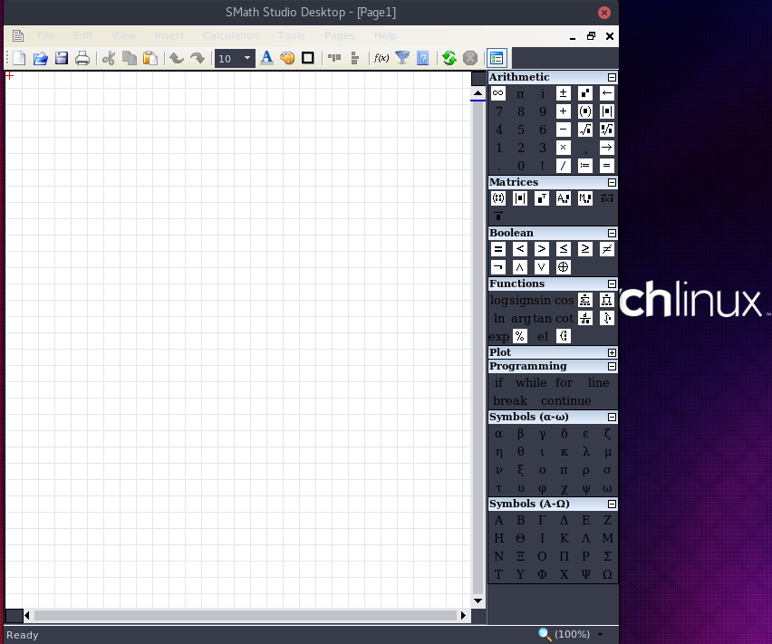
For example I've attached the way SMath looks in my computer in dark theme mode on gnome.
The top menu bar is white text on light grey background and the quick selection boxes on the right are inconsistent.
Can this be improved upon to make using this a little more comfortable to the eyes?
Best regards,
Tom